Wednesday, May 20, 2015

WIP: Log Cabin in Taupes or "How I Fell in Love with Browns"

In a few weeks my grandmother turns 92. A few years ago she moved back to Ohio after many years in North Carolina. Ohio has a long history of traditional quilting, and I wanted to make a special quilt for my grandmother's birhday that celebrates her life and symbolizes this simultaneous home-coming and home-building. It seemed to me that the natural choice was a log-cabin quilt.
A block for my grandmother's log cabin quilt

Construction Diagram by Janet Wickell
A traditional log cabin quilt features a combination of light and dark fabrics arranged around a central square. A red center is said to symbolize the hearth, source of warmth and light where the family gathers inside the home. Log cabin quilts became especially popular in the US shortly after the civil war era, and were often pieced from small scraps on a muslin foundation. Late nineteenth century log cabin quilts incorporated textured fabrics like silks, wools, and velvets.

When I plan a quilt with a specific person in mind, one of the first things I think about is that person's style and their personal color scheme. When I picture my grandmother's home, the main colors I see are brown. My grandmother is an extraordinarily practical person. Her cupboards and lightswitches have labels. Her couches are protected with towels. Things have specialized containers and assigned places. Brown furniture, walls, and carpeting are practical, because when brown gets dirt on it, you can't see the dirt (my grandmother would still make sure there was no dirt, but just in case, brown). Brown indoor-outdoor carpeting is even more practical, because it won't mind getting wet when a hurricane decides to flood your house.

In my youth, I was skeptical that brown could be a favorite color, because it was the color of dirt. But I knew people who claimed it as theirs, so I had to stretch my imagination and believe that it could indeed be someone's very favorite. As I grew older I came to love brown as a color of soil, bark, nutmeg, coffee, my brother's eyes. Psychologist Carole Kanchier says that brown projects honesty, stability, practicality, and commitment. It has seriousness and depth. I sometimes wear brown when I want to feel grounded. It connects me to the earth.

Something else I've learned about brown while trying to sort my fabric scraps: browns participate in many other colors. Browns can be red, blue, yellow, green, purple... Learning to perceive their variety and subtleties can turn a previously muddy picture into a visually rich exploration of colors' hidden possibilities and interactions.

I recently came across a beautiful lot of Japanese taupe fabrics on ebay. The description of this lot indicated that the seller had collected these fabrics. I had not known that this was a category one could collect, but it piqued my curiosity, so I began to research its history and use.
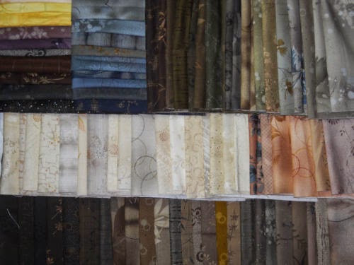
Japanese taupe fabrics from the Centenary Collections by Yoko Saito for Lecien Fabrics and Daiwabo by E. E. Schenck Co.
My googling took me to a wonderful post by Steven of One World Fabrics on "The Color of Taupe." Taupe, of course, is more than brown - it involves a mixture of brown and grey. One piece of advice Steven offers for quilting with taupes is to incorporate variety in value and hue. Mixing light and dark and taupes with different color bases (red, blue, green, yellow, etc.) produces a more pleasing visual palette, replicating the beauty of a hundred tiny pebbles from a river, each with a different mineral composition.

Although my palette veered more toward the brown side of taupe, I took this advice to heart in selecting fabrics for my grandmother's quilt. In the spirit of late nineteenth century log cabin quilts, I decided to use fabrics that incorporated a rich variety of textures and fiber content as well. To achieve this, I used decorator samples from swatch books by Kravet, JAB, Highland Court, Lee Jofa, Andrew Martin, and others. These are all high-end fabric designers, adding a touch of bargain luxury that I thought my very frugal grandmother definitely deserved. The fabrics included silk, chenille, damask, linen, velvet, jacquard, cottons, and luxury blends. These fabrics are not all easy to work with, and they produced a mess of fibers that gave me sinus headaches and sent our vacuum cleaner to the vacuum cleaner hospital. It was worth it.
My grandmother's log cabin quilt top


In keeping with the traditional light and dark color scheme, I used whites and off-whites for my light fabrics, and browns and taupes for my dark fabrics. A few fabrics, dark beiges or light tans, could have worked in either category. When I used them I worked to ensure that there was adequate contrast within the block to keep the color scheme intact.

My center squares were 1 1/2" cut or 1" finished, and each log was similarly cut at 1 1/2" wide for a finished width of 1".  I designed the blocks with seven logs on each side - this creates a larger block and yields a fairly simple overall design that is more static than I might have chosen for myself, but it has a certain tidiness and precision that I think suits my grandmother perfectly. I chose to have six white diamonds framing two brown diamonds to represent her family: two parents in the middle, surrounded by their six children, my mother, aunts, and uncles. It reminds me of the portrait wall in my grandmother's house in North Carolina, which featured a beautiful framed portrait of each of them in their youth.

The thickness of the fabrics used in the quilt top will make this a bit of a bear to quilt on my home machine, so I expect to keep the quilting fairly simple. I will share pictures when it is done.

Quilts are often handed down from generations. I like the idea of handing this one up. I'd love to hear your own stories of quilting for parents and grandparents.

Albers' Bluest Blue

In a previous post (Inspired by... Josef Albers), I wrote about my first encounter with the work of German born visual artist Josef Albers. Albers' work on color, particularly in his book Interaction of Color, emphasizes color's relativity and instability, capacity to decive, ability to evoke different readings in different contexts. Intensity, placement, boundaries, recurrence, and extent all influence how a color is perceived and how it interacts with other colors in a composition. Albers wants his audience to learn to see how colors can act and relate to one another. His method "places practice before theory," and aims to cultivate sight that is closely linked with imagination and fantasy.

My Homage to Albers: Bluest Blue
I am eager to learn from Albers for my own work as a quilter. The first of Albers' practical exercises I chose to quilt is an exercise in color intensity, specifically in perceiving brightness (Interaction of Color pp. 16-17). Albers' years as a teacher taught him that it is a relatively easy matter to train a group of artists to perceive light and dark gradations uniformly. But when it comes to brightness? It's not so simple.

We each have different preferences, different tastes, and colors we just don't like. Our preferences change with mood, or with stages in life. A color we can't stand one year, we may fall in love with once we begin to truly understand how it works, how it interacts, what depths and heights it is capable of (browns, anyone?).

Albers sought to cultivate this understanding by having students sort "all possible shades and tints within a hue" and then choose the hue they considered "most typical": reddest red, yellowest yellow. The study I chose to reproduce is Albers' rendition of an exercise in choosing "the bluest blue."
Josef Albers' exercise in color intensity - brightness: "the bluest blue"

My quilt, pictured above, doesn't reproduce Albers' tints and shades exactly, but I tried to replicate them as closely as I could with the colors I had in my stash.

Albers states, somewhat enigmatically, that "the most typical hue...is placed within the group accordingly." That is, we're supposed to be able to spot it based on its prominence within the composition. My eye - in Albers' composition and in my quilt, is drawn to the third blue from the bottom. Is it a coincidence that looks like Duke blue to me?

improvised quilt back
For the quilt back, I used scraps from the blues used on the front of the quilt along with a variety of whites and off-whites, including scraps from the background fabric I used for the quilt top. I improvised the piecing to create a modern composition that re-scrambles Albers' sorted tints and shades. My off-grid composition was pieced in five columns of uneven widths. These widths were largely determined by the size of the scrap I was using, a wonderful constraint that minimized planning and let serendipity rule the results.

detail of echo quilting on quilt back


For the quilting, I echoed the blocks on the front of the quilt. I used the upper feed dog on my walking foot as a guide for spacing the echo-lines. This method yielded quilting lines that are roughly 1/4" apart. I absolutely love the textured effect from the dense quilting (see detail of quilt back). That said, the quilting was a labor-intensive process requiring many hours to complete. The dimensions of this quilt were 51" x 60". It would have been difficult to complete wrangle a larger quilt using this method on my home machine.

In my next post I'll share a work in progress (aka "how I fell in love with browns"). In the meantime, happy quilting, crafting, reading, painting, dancing, writing, digging, building. And enjoy this beautiful spring day!

Friday, May 8, 2015

Punctuation

I am a volunteer Crisis Line Advocate for the Durham Crisis Response Center. This means answering calls from individuals who are seeking help in situations of domestic violence or after experiencing sexual assault. A recent shift left me without words. The callers had described horrific situations, and I felt I needed a nap to release some of the tension. But as I lay in bed, I could not sleep. Instead, my mind kept picturing a single image - a giant exclamation point. Sometimes in the face of brutality and intimidation, that's the best I've got. But then I want to do something.

The giant exclamation point turned into an idea for a quilt (detail on left). My nap was over before it began, and I raced downstairs to start sketching and cutting.

In case you worry that I neglected my needed self-care in this time of stress, a clinical study by Dr. Robert Reiner, commissioned by the Home Sewing Association, found that sewing is more relaxing than reading a newspaper, playing cards, or painting. We get in our flow, cortisol goes down, dopamine goes up. Without it, I'm a total stresscase. I used to get relief from running and kickboxing, but I've been rehabbing a knee and glute injury for many months now. Sewing it is.

I decided to design the quilt in black and white, and cut a pile of 6" squares from each. Some I would leave blank, to represent the missing words. On others, I would center a single punctuation mark. I began with the basics - exclamation point, question mark, comma, period, colon, semicolon. I expanded my scope to include quotation marks and apostrophes, brackets and parentheses, en dash and em dash, ampersand and ellipsis. With a nod to the digital age, I included the hashtag, at-sign, forward slash, AND back slash.  A caret and asterisk (thank you Origen) for editing. But now I had run out of marks.

I arranged my empty squares and punctuation marks in a tentative layout on the "design-sofa" (I don't have a design-wall, so I use the couch) and called my son in to consult. His first reaction was that he wanted this quilt. He is a young writer, and a grammar nerd to boot. How could I say no? His second reaction was that there was too much empty space. We needed more punctuation. Where would we get it? Where else? The internet.

A bit of speed-googling led us to into a world of nuanced excitement. The ElRey mark, proposed by one Ellen Susan, conveys roughly half the force of an exclamation point. It is named for Ellen's dog, who "was a master at communicating feeling with graceful understatement." So if you, a person of dignity and restraint, abhor the overuse of the exclamation point in texts and emails, but nonetheless wish to convey your moderate enthusiasm, this one is for you.
If you lack enthusiasm and instead trade in sarcasm, irony, or uncertainty, there are marks for you as well. My renderings appear below. Counterclockwise from upper left are: 1) Alcanter de Brahm's irony mark; 2) Herve Bazin's doubt point, introduced in his 1966 book Plumons l'oiseau; 3) Card Chronicle's "don't take that too seriously" mark; and 4) the patented SarcMark, to make sure people know you meant the opposite of what you said, and not in a nice way.
These marks completed our quest for punctuation. For the border, I used pandas, in honor of my favorite punctuation book, Eats, Shoots, and Leaves: The Zero Tolerance Approach to PunctuationThe book's title is based on a grammatical joke:

"A panda bear walks into a bar and orders a sandwich. The waiter brings him the sandwich. The panda bear eats it, pulls out a pistol, kills the waiter, and gets up and starts to walk out. 

The bartender yells for him to stop. The panda bear asks, "What do you want?" The bartender replies, "First you come in here, order food, kill my waiter, then try to go without paying for your food." 

The panda bear turns around and says, "Hey! I'm a Panda. Look it up!" The bartender goes into the back room and looks up panda bear in the encyclopedia, which read: "Panda: a bear-like marsupial originating in Asian regions. Known largely for it's stark black and white coloring. Eats shoots and leaves."

Incidentally, overabundant commas have been known to induce violent behavior in college professors as well.

Birds join the pandas in the upper right corner of the quilt, in honor of Bazan and because birds are punctuation in flight. Together, the pandas and birds form a giant right bracket.
Punctuation quilt top
My son wanted black for the quilt back, but I didn't have quite enough. I used the black that I had along with white scraps from the quilt top and other black and white prints from the scrap bucket. I pieced improvisationally, which is my favorite way to work.
improv backing
For the quilting, I chose cursive writing. Using a white thread that alternately disappears and reasserts itself against the white and black background, I wrote out the first lines of one of my son's literary compositions, "Mute." The piece is an emo-magical-realist vignette about a young man who has ripped out his own voicebox. Though he narrates in the first person, he expresses his deep pain at his inability to speak what he feels. "Mute" symbolizes my son's own frustration at how hard it is to put thoughts and feelings into words when they spin so fast and far. It was a perfect pairing with my own speechlessness with which this quilt began.
cursive quilting
Ampersand, frozen
 If you think you noticed some ink blotches on the quilt top, you are correct. I prewashed all my fabrics, but made one critical mistake. I appliqued the ampersand from vintage 1930's trim, and did not think to prewash it. When I washed the finished quilt, the ampersand bled profusely. #%$^@!

The quilt went in the freezer while I took a trip to the store to get dye-catcher sheets and special detergents. Seven washes later, some, but not all, of the ink came out. The sarc and irony marks took a beating in the process. But my son, God bless him, likes it just as it is. He says the ink blotches remind him of the imperfection of writing. And maybe it's ironic - or just appropriate - that the irony mark still can't get the respect it deserves.

Sunday, May 3, 2015

Yoshiko Jinzenji's Graphic Squares

Kyoto native Yoshiko Jinzenji has influenced modern quilting more than almost any other single artist. According to an interview by ModernDayQuilts, Jinzenji sews in silence, her favorite color is white, and her favorite time of day to quilt is at night. Her motto? "Truth is Almighty."

Another, more detailed interview with Jinzenji paints a picture of an artist whose work is truly international, with influences from Mennonite and Amish quilting, Japanese industrial culture, and the lush naturescape of Bali. At the same time, Jinzenji is evasive about where she fits in the world of modern or even Japanese quilting. What is very clear: Yoshiko Jinzenji does her own thing, and it is beautiful.

Jinzenji's work is displayed in museums in the UK and USA, including the Victoria and Albert Museum in London and the Museum of Art and Design in New York. 

detail of Star Connection, Yoshiko Jinzenji
Pictured here is her Optical Quilt "Star Connection" on display at the Museum of Art and Design:
Star Connection, Yoshiko Jinzenji
While browsing on Etsy one day, I came across a set of patterns by Jinzenji, sold by ZakkaWorkshopStore. The patterns were originally published in her now out-of-print book Quilting Line + Color: Techniques and Designs for Abstract Quilts (Interweave, 2011). For my introduction to Jinzenji's techniques, I chose a very simple pattern called "Graphic Squares", left.

The quilt top is made from only 40 pieces of fabric. Given that one of Jinzenji's quilts is entitled "10000 squares", this is minimal indeed. The power of the design comes from the combination of solid black squares with a variety of carefully chosen graphic prints, stripes, and textural fabrics.

The method for selecting fabric squares begins with creating a window-frame from white card-stock. I used an exacto knife to create mine. The window opening is the size of the finished square, in this case 8 cm x 8 cm. The frame itself is at least 3 cm wide. The frame allows you to isolate part of a print to see how it would look on its own.

Below is an example of using the window-frame to identify two different possible graphic squares from one large scale print:
 Because I did not have an 8 cm acrylic template for cutting, I used the square that I cut out of the window frame as my template. I applied a thin layer of basting spray to one side of the cardstock square. After identifying the section of fabric I wanted to cut, I placed the square inside the window-frame, sticky-side down, pressed it onto the fabric with my fingertips, then removed the window frame. I aligned the 1/4" line on my Omnigrid ruler with the edge of the cardstock square as I cut each side of the square, creating a quarter inch seam allowance on all sides.

Identifying the graphic squares to use was easily the most enjoyable part of making this quilt, and it began with collecting a set of bold, modern prints. The fabrics I used included a variety of Marimekko prints, including many from a vintage swatch collection, as well as a few newer prints by Etsuko Furuya for Kokka. Four of the white squares came from a recent low-volume fabric swap hosted by the Triangle Modern Quilt Guild. Thank you guild members!

Jinzenji's design used reds, greens, and yellows. I found I did not have a lot of greens to work with, so I substituted blues and aquas, and brought in complementary oranges to balance them. Jinzenji also used a beautiful muted water-color print. I didn't have anything quite like that, but added some grays to achieve a similarly muting effect.

My Graphic Squares quilt
The pattern calls for horizontal channel quilting spaced 1/4" apart. Because of the smaller size of this quilt, I decided this would be a great opportunity to try out matchstick quilting instead. Matchstick quilting creates parallel lines no more than 1/8" apart. Here are a couple of closeups of the quilting:


The technique creates beautiful texture. It also creates a stiffer quilt. To compensate, I used a wonderful strie velvet by Christopher Hyland for the backing. The subtle striping on the velvet provided guide-lines for the quilting, eliminating the need to mark lines on the quilt and allowing me to keep the lines parallel without a lot of trouble.
Velvet backing makes the quilt cuddly-soft
blind stitch to attach binding to back of quilt
The velvet did pose some challenges when it came time to bind the quilt: it's a slippery fabric, and I was not able to attach the binding neatly to the back by machine. This difficulty presented an opportunity to learn how to finish a binding by hand. Jinzenji's work frequently combines machine and hand techniques, so this seemed especially appropriate.

I used a blind stitch, shown left, with a single strand of hand-quilting thread by Gutermann. The hand-quilting thread is strong and is specially coated with a glace finish to resist tangling. It was my first time using this thread, and I was very happy with the choice.

I also finally learned how to make a "quilter's knot" to secure my thread. If you are not familiar with this handy little trick, check out Sunny Standing's video on how to tie a quilter's knot.

I am in love with this little quilt (which is now for sale in my etsy shop, BlueCanaryQuilts) and am eager to try out other patterns by Yoshiko Jinzenji. In the meantime, I'd love to hear your thoughts on the execution of this pattern, or how Jinzenji or other modern fiber artists have influenced your own work.

Friday, May 1, 2015

Inspired by... Josef Albers

Josef Albers, Interaction of Color
I recently watched a webinar called "Modern Quilting: Know It When You See It" by modern quilter Jacquie Gering, on the Modern Quilt Guild  members' site. Jacquie's presentation addressed the question "What is Modern Quilting?" and mapped a spectrum from traditional to modern. One influence she named for modern quilting is modern art. In my own attempt to better understand what defines modern quilting, I thought it would help me to better understand the history of modern art and design.

Josef Albers, Homage to the Square 
My first stop in this journey of discovery was the work of Josef Albers. Like my mother's family, Albers was a German Catholic who emigrated to the United States during the Nazi regime. Before leaving Germany, Albers was a professor at the Bauhaus from 1922 to 1933, specializing in furniture design and stained glass, a medium that has much in common with quilting. After immigrating to the United States, from 1933 to 1949 he directed the painting program at the newly opened art school Black Mountain College in Black Mountain, NC. In 1950 Albers joined Yale University's department of design, which he chaired. He remained in New Haven for the remainder of his life. I share aspects of identity and place with Albers. What most drew me to his work, however, was his focus on color.

Josef Albers, Transparency
Albers paintings are "quilterly", and to me they beg to be interpreted in fabric and thread. I am not trained in art, but I have ordered Josef Albers' influential book Interaction of Color with every expectation that it will serve as a primer for me in my experiments with color as a quilter while also helping me gain a greater understanding of the modernist aesthetic.

After finishing my Carolina Blues quilt top, I wanted to make a quilt back for it that used the same color scheme: a spectrum of dark and light blues paired with neutrals. Because my fabric purchases are predominantly scraps, remnants, and the occasional irresistible fat quarter bundle, I don't have a lot of yardage for single-fabric backings, and usually default to a pieced backing. The Josef Albers color study on the left, below, from Interaction of Color, seemed just the thing. 

Josef Albers, Interaction of Color, v-3
I aimed for a simple rendering. That is, I didn't use Albers' piece to inspire a new design, but attempted to recreate his design in a different medium. My hope is that as I become more familiar with his work and the principles behind it, my own designs will use his work as a foundation rather than a template. 

For this piece, I worked from an 8"x10" color print-out, pictured below. 

My construction notes
Based on my estimate of the amount of background fabric I would need and the amount I actually had, I set a scale in which 1 cm on the print-out would equal 2.6" in the quilt. I kept a calculator handy to help me gauge where to position each block and how much background fabric to put where. I determined that the blue blocks would be 8" x 32" finished or 8.5" by 32.5" cut. I used a protractor to measure angles in the original design and to replicate them in the positioning of the blocks. I made up my methods as I went along, which meant there were a lot of mistakes, and not all of the angles or block positions replicate those in Albers' original. 

The overlapping of blue blocks created some particular construction challenges for me because I cut the blue blocks whole at the beginning of the project (a few were pieced because of the dimensions of the fabric remnants I had at hand). If I did a similar design in the future, I would plan to piece some of the blocks during construction to better accomodate the overlapping, particularly in the second block from the bottom and from the top.

As it happened, I did not have enough of the background fabric to make a quilt back for the Carolina Blues quilt, so I have decided to make this Homage to Albers into a quilt of its own. It does not want to lie quite flat (though as I look at this picture, I am hoping it isn't quite as puckered as it appears!), so I will need to make some tucks before I attempt to baste and quilt it, but I am still very happy with the results.
Pick Your Blue: Homage to Albers
What modern artists have inspired your quilts?

Carolina Blues

Carolina Blues quilt top


For a recent quilt guild meeting, we were told to bring a small quilt sandwich on which to practice hand quilting. To prepare something quick, I sat down one evening with a pile of fabric strings - those long skinny strips of fabric that get trimmed away at the end of a project - and started sewing them together. Then I started cutting the pieced strings into 10" squares. On a whim, I cut those squares into quarter triangles, and began experimenting with ways to put them back together.

I found that with two 10" squares cut into quarter triangles I could make two different blocks: one a set of nesting squares, above, the other a striated cross, below. My hand quilting, as it turns out, was abysmal. I'll be needing a lot of practice before I go public with that. I ripped out the offending stitches and finished this little trivet, pictured, on the machine.

string piles
In the meantime, I was intrigued by the design, and wanted to see what kind of optical effects would be created by piecing sets of matching and contrasting blocks together in a quilt.

In case you'd like to try it for yourself, I'll share the steps. It's a very easy way to use up odd pieces of fabric. While working with small strings can be time consuming, the actual piecing is a cinch. For those who are experimenting with improvisational quilting, this technique offers a great balance between improv and structure.

For the larger quilt, I thought green might be a bit overpowering, so I decided to work with blues. I live in North Carolina, and my household is divided between Duke and Carolina. So, naturally, the quilt would have to combine broody Duke blue with ebullient Carolina blue. To give definition to the design, I decided to alternate between dark and light strings. The dark strings I chose were shades and tones of blue violet, cerulean, blue, and turquoise. The light strings included pale blues, violets, aquas, and pinks as well as a variety of neutrals in gray, white, off-white, and tan.

In general, strings were between 1" and 2". I preferred the visual effect of narrower strings, but I felt that variety was also important. To reduce waste but leave a comfortable margin of error, I trimmed the strings to around 11" before piecing them. I then pieced them together along their long edges, always starting from the same end. This yields one end that is fairly even and one end that is irregular.

A string-runner?
For lack of a better term, I'll call the resulting stretch of pieced strings a "string-runner." In the process of making this quilt, I made some very long string-runners - ranging from 40" to 100" long. To keep the runner from taking over the table as it grew, I rolled it up like a sushi-mat to the left of my sewing machine.

10" square blocks
When the string runner seemed long enough (i.e., when my back hurt, my pile ran out, and/or I got sick of sewing strings together), I took it over to the ironing board and pressed all the seams in one direction. In my opinion, there are WAY too many seams to press them open at this stage. Later, when piecing the half-square triangles together, it is helpful to finger press the center seams open to reduce bulk at the points.
This looks nothing like grilled cheese, but my choice
of similes suggests that I might be hungry.


After pressing the string runner, I first cut the runner into 10" widths. Then I trim those into 10" square blocks. Next, I cut each block diagonally into fourths, like a grilled cheese sandwich. You can see in the picture on the left that the resulting quarters have two different patterns. If you were to arrange the triangles with the hypotenuse at the top, one pair would have horizontal stripes, and the other pair would have vertical stripes.

Working with two blocks at a time, I swapped out two opposing quarter triangles from one block for two opposing quarter triangles from the other block. This has the result of grouping all the horizontal stripes together in one block and all the vertical stripes together in the other block. After piecing four quarter square triangles together to make each block, as shown on the right, the resulting blocks, like the green ones above, share the same fabrics but have two different patterns.

The next step is to square the blocks. They should each form a 9" square. It's especially important to remove the little sticky-out triangle flags that form off the corners. If you don't know what I'm talking about, you'll know it when you see it! Trimming off the little sticky-out triangle flags (that's the technical terminology, right?) makes the piecing much easier.
This is the tricky block: lots of stretch along the edges

When it's time to piece blocks together into rows, beware: the blocks like the one on the left will want to stretch. The blocks like the one at the top of the picture on the right will not want to stretch. When you piece them to one another, extra care is needed to keep the rows lined up properly and ensure that your points match up from block to block.

There are all kinds of ways to play with these blocks and to let them play with one another. The arrangement I chose, featuring eight rows of nine blocks each, is pictured below and at the top of this post, in two views of the completed quilt top. (The math will tell you that I had nine blocks leftover, and these will probably turn into a mini-quilt).

The alternations of light and dark in the strip piecing allow the nested squares to recede and advance, creating movement and depth. The piecing also creates a diamond grid, allowing the eye to shift between focusing on diamonds, squares, and crosses in a playful optical puzzle.  
If you try out this technique, I hope you will share your creations. Sky's the limit.