Monday, June 22, 2015

Modern Flying Geese

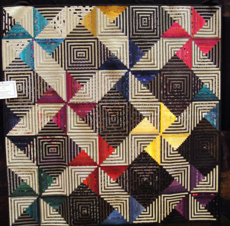
detail, my Modern Flyng Geese, 2015
A few months ago I saw a pattern on Etsy called "I'm Flying Modern" by Elena, featuring bright, modern solids against a lovely gray cross-hatched sky. Her quilt inspired me to design my own modern flying geese quilt.

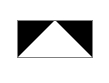
Flying geese blocks are simple, but somewhat tricky. In the diagram below, the white portion of the block is the goose, and the black is the sky. Contrast between the two is important for achieving the illusion of a bird in flight. A row of flying geese blocks is meant to represent the orderly migration of a flock of geese.

In late December I had purchased this wonderful collection of Pure Elements solids, pictured below, inspired by Frances Newcombe's Safari Moon print collection for Art Gallery Fabrics.
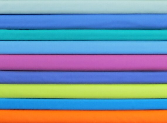
gorgeous Pure Elements solids: a starting point for my palette of geese
After auditioning the fabrics, I decided not to use the chartreuse and orange. Instead, I swapped in some spring green, purple, and pale peach. 

The bright colors would be my very energetic geese. They would travel boldly across cloudy skies, some puffy white snow-clouds, some lightly overcast, others stormy grey or darkest night. They would form orderly rows, but they would not all be going in the same direction. 


I made all the geese first, then settled on a layout. As this was my first time making flying geese blocks, I used a helpful tutorial, linked here, by Karen Johnson from ConnectingThreads. You can see that I managed to preserve most of my points, but the height of my geese blocks was not uniform. I answered my momentary longing for order and perfection (I know, ridiculous on both counts) with a reminder that in nature, geese, like people, come in all sizes. Why should mine be any different? I can only tolerate so much order, anyway. Clouds, on the other hand, remind us of the imaginative possibilities of a glorious disorder. The answer? An extra patch of cloud chasing the geese, above left. 

For the border, I used a geometric print by Sunbrella that reminded me of moons and snowballs and seemed a perfect whimsical pairing for my happy geese. For the backing I chose a field of mushrooms in a grayish taupe. I don't know if geese eat mushrooms, but if they do, they'll have plenty to snack on. 

Rows of echo quilting accentuate the geese and create a whimsical zig zag effect on the quilt's back. I pieced the binding from a wild variety of bright printed fabrics that coordinate with the geese and frame the neutral border with a riot of color. Despite their appearance of order in flight, geese can be rambunctious. I like that. From a safe distance. 

Update on Modern Flying Geese: I am delighted to report that this quilt has been purchased and the geese are flying to their new home in Australia. Safe travels!

Sunday, June 14, 2015

Habitats: log cabin tours the biosphere

Detail, Habitats, 2015, by me, adapted from Karen Stone's Summer Nights, 1992
After completing Priestess for my grandmother, I wanted to continue working with log cabin blocks in browns. (Warning: this may become a long-term obsession.) The layout I chose for Priestess, which I blogged about here, was quite static, and for the next quilt in the series I wanted more movement. I am still learning the many possibilities of log cabin blocks. A google search on "stunning log cabin quilts" turned up this breath-taking creation by Karen K. Stone, called "Summer Nights" (1992).
Karen K. Stone's Summer Nights, 1992, the inspiration for Habitats
I instantly fell in love with this design. The play of light and dark that is foundational to the log cabin block is extended into the design of the whole quilt, which gradually shifts from light to dark as the eye moves from the upper left to the lower right. Dark squares recede, creating an illusion of depth, while colorful pinwheels occupy the foreground and spin outward in an optical dance.

I had found my next project. Keeping Karen Stone's optical design, I shifted the palette from energizing summer to earthy autumn. I kept some black fabrics in the design, but blended them with a variety of browns and taupes, and I lightened the overall color scheme. I sacrificed some of the optical effects in the process, but the result felt softer to me and a bit more organic.

All credit for this ingenious design is Karen's. Yet it was important to me to add something new. I imagined the quilt as an expression of the biosphere, a mosaic of natural habitats ranging from forest to desert, jungle to ocean. I included numerous animal prints among the dark strips, and worked to allow each section of the quilt to convey the colors and textures of a distinctive eco-system during day and night. The effect is subtle, not overly literal, and I was absolutely delighted when my son saw it without my prompting.

The quilt contains forty-nine blocks - seven rows of seven. Seven is a number of perfection and totality. In the biblical book Leviticus, forty-nine years culminate in Jubilee, a time of celebration, renewal, and liberation for the land and all who live in it.
Habitats, quilt top, by me, 75" x 75"
Here are some details for the curious: each log has a finished width of half an inch, and there are ten logs on each side of each block. This is a scrap quilt, incorporating hundreds of different fabrics, mostly quilting cotton but also silk, linen, a touch of velvet, and designer decorator blends. It will be a little while before I have a chance to finish this quilt, but I'll be sure to report in when I do.

Do you have unusual log cabin layouts to share? How have you made them your own? I hope you will share some of your favorite creations. 

Friday, June 12, 2015

Priestess of Her Generation

Priestess quilt, for my grandmother
 A few days ago I finished making this improvised log cabin quilt for my grandmother Jane's ninety-second birthday. In an earlier post, Log Cabin in Taupes, I blogged about the work in progress. Shortly after that, I was able to give my mother a sneak preview of the completed quilt top. 


As so often happens, my mom saw something I had not. She saw that the white and cream crosses, made of lustrous silks and embroidered linen and framed with red and gold accents in silk and velvet, were the sacred vestments of a priest. 
From left: my mom, me, and my grandmother, 2013
My grandmother's brother Don was a priest in the Catholic church for many years before his death. Her son John is also a priest. She is devoted to the sacraments of the church, especially to the eucharist. My mother stated with clarity and certainty: "I have always thought that my mother was the priestess of her generation."

This quilt then, will be my grandmother's sacred garment. It is a testimony to the family she raised, the home that she made, the beauty of her art, and the resourcefulness, poise, and silken steel with which she faced life's many challenges. It is also a material sign of her deep faith, her life of prayer and sacraments, her mysticism, and her ministry.

The back of the quilt, made of linen by Robert Allen,
 shows the quilting lines: jewels for Queen Jane 
The rich visual texture of the piecing did not require complicated quilting. I chose quilting lines that suggested the facets of cut gems. My grandmother has never lived in luxury, but she carries herself like royalty. One of her nicknames is, aptly, Queen Jane.

My mother and father travel to visit my grandmother on Saturday to celebrate her birthday. I mailed the quilt on Wednesday in hopes that it will arrive on time for them all to see it together.

Happy birthday, Nani Jane! You are priestess and queen. You are inspiration and grace. With this quilt I send blessings and so much love.

Monday, June 8, 2015

Bowmansville Star meets Hurdle Mills


My Spoonflower challenge quilt
Earlier this year, the Triangle Modern Quilt Guild teamed up with our super spunky hosts at Spoonflower to create a charity quilt challenge. The challenge came in two parts: first a contest to select the fabric palette, then making and submitting the quilts. The quilts will be donated to children in foster care in our area.

The winning fabric palette was composed by quilter Sarah Lowry, who blogs at Stitching and Bacon. It combined a range of pale and dark blue prints with coral and citron accents.
Sarah Lowry's fabric palette
Each of these fantastic prints are designed by Spoonflower customers for Spoonflower customers. They are, clockwise from upper left, 
Hettie Weaver's Bowmansville Star quilt, ca. 1880, featured in Quiltmania
For part II of the challenge, guild members received a bundle of six fat eighths (an eighth of a yard of fabric cut 9" x 21"), one for each print. We were allowed to incorporate three solids in our quilt design. 

I was inspired by a photo in the January - February 2015 issue of Quiltmania , which reported on the 20th European Patchwork Meeting. One of the historical quilts exhibited at the meeting was Hettie Weaver's Bowmansville Star, dating from ca. 1880 and measuring about 82" square. I grew up about 90 miles from Bowmansville, PA, and, though I'm Catholic myself, attended Mennonite youth fellowship at Bethel Mennonite Church in Gettysburg, PA with my best friend when I was a youngster. I felt a kinship with Ms. Weaver. Spending time adapting her beautiful quilt allowed me to revisit places in my memory and heart and reflect on the simplicity and beauty of the Mennonite tradition.

Ms. Weaver's quilt used a lot of yellow and orange, so I chose those for two of my solids. I then needed a darker color. I had no black or navy blue on hand, so for good or ill, I chose purple (I had a lot of it). With my 6 prints and three solids in hand, I mapped out Ms. Weaver's design in an Excel spreadsheet. I modified the design to accomodate the limited quantities of Spoonflower fabrics I had to work with and the limited value contrasts I could achieve with the solids. Similarly, to get the most mileage out of the Spoonflower prints, I decided to work with 1.5" squares, turning my Bowmansville star into a postage stamp quilt composed of eighteen-hundred and forty-nine (1849!) 1" finished squares and measuring a little over one fourth the size of Ms. Weaver's original quilt. I seem to have taken the "challenge" part very seriously.

Excel spreadsheet design
Laying out the squares was like putting together a puzzle. The piecing was not especially difficult, but required many hours. For the quilt back, I needed something simpler and quicker. I used the same color scheme in a scrappy improvisational brick pattern. After I finished quilting, squaring the quilt gave me just enough trimmed backing fabric to make a happy pieced binding.
Back of my Spoonflower challenge quilt
For the quilting, I echoed the around-the-world and sawtooth-star design elements. High loft batting added a touch of puff to the channels:
As you can see, the finished quilt is really, um, bright. But it is a star, after all. I pray that it brings light, good cheer, and a little silliness into the life of a child. And I hope it conveys the message: you are greatly loved.